Lisa Ishii, conceptrice lumière (I.C.O.N.) a créé un concept global de mise en lumière des façades des hôtels Daiwa Roynet au Japon. Voyage en lumière (et en bilingue) à Kyoto, Tokyo et Ariake.
I.C.O.N. (Lisa Ishii) a éclairé plusieurs hôtels de la chaîne Daiwa Roynet dans différentes villes du Japon en créant à chaque fois un éclairage adapté au lieu, au contexte, etc. Par exemple, à Kyoto, elle a utilisé les couleurs traditionnelles des cols de kimonos des nobles d’autrefois.
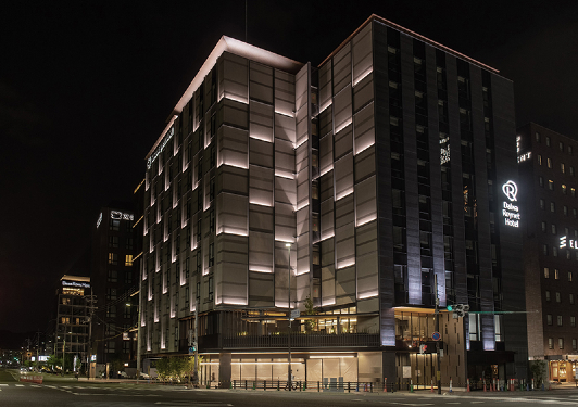
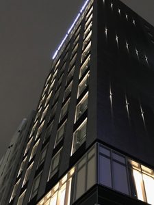
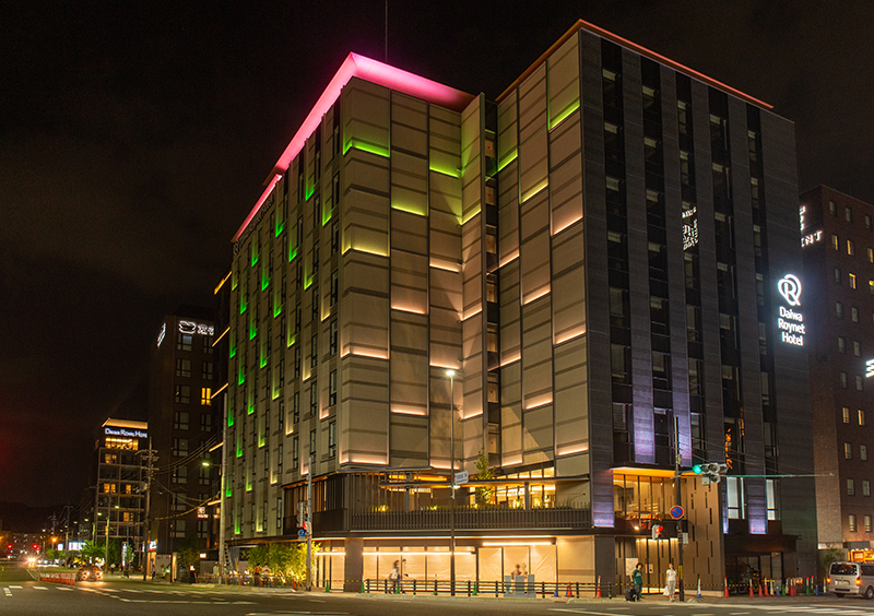
DAIWA ROYNET HOTEL TOKYO KYOBASHI
Maître d’ouvrage : Daiwa Royal
Architecte : Azusa Sekkei Architects
Matériel d’éclairage : iGuzzini
Vidéo : https://youtu.be/GOdhS8ZKQmE
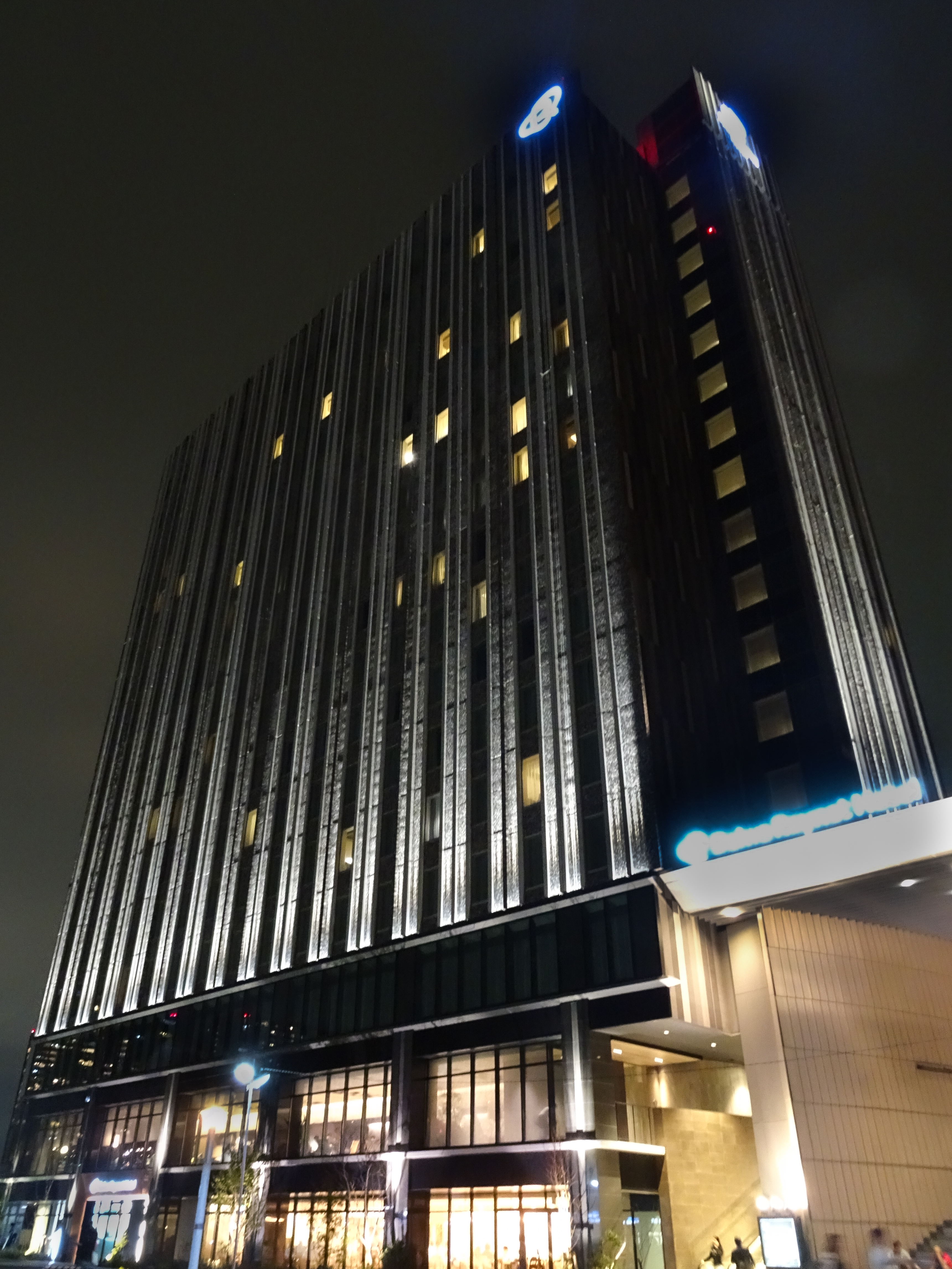
En février 2020, la chaîne Daiwa Roynet ouvre son troisième hôtel (après Ariake et Kyoto) pour lequel I.C.O.N. a été sollicité pour créer l’éclairage extérieur et apporter son expertise sur l’intérieur.
« Nous nous attachons à valoriser chaque fois différemment le design de l’architecture en lien avec l’atmosphère de la ville où il se situe », explique Lisa Ishii (I.C.O.N.). Pour Kyobashi, nous avons créé trois scénarios fluides donnant vie au bâtiment avec un « stream lumineux » élégant, corrélé au rythme du cœur de Tokyo.
Pour les espaces publics intérieurs (lobby, couloirs etc), nos échanges avec l’architecte ont été fructueux. Chaque cadre de fenêtre est encadré de lumière, un dispositif sobre à l’effet lumière élégant. L’idée est simple mais pas banale, nullement dans les habitudes au Japon. Le soulignement est bien net grâce à des appareils précis et la source complètement invisible. Même de l’intérieur, on ne la voit pas.
Cet effet architectural fixe devient un lent stream lumineux diagonal. Un autre scénario allume et éteint le bâtiment tel un doux battement de cœur urbain. Le troisième est un mouvement d’un côté à l’autre, avec une colonne de fenêtres qui s’éteint au rythme de la marche. On crée ainsi une belle image nocturne pour cet hôtel business et une place pour lui dans le tissu urbain en corrélation avec le rythme de vie nocturne.
In February 2020, the Daiwa Roynet chain opened its third hotel (after Ariake and Kyoto) for which I.C.O.N. was asked to create the exterior lighting and provide its expertise on the interior.
« We strive to enhance the value of architectural design each time differently in relation to the atmosphere of the city where it is located, » explains Lisa Ishii (I.C.O.N.). For Kyobashi, we created three fluid scenarios that bring the building to life with an elegant « light stream » that correlates with the rhythm of the heart of Tokyo.
For the interior public spaces (lobby, corridors, etc.), our discussions with the architect were fruitful. Each window frame is underlined by light, a sober device with an elegant light effect. The idea is simple but not banal, by no means common in Japan. The underlining is very clear thanks to precise devices and the source is completely invisible. Even from the inside, you can’t see it.
This architectural effect becomes a slow diagonal light stream. Another scenario switches the building on and off like a gentle urban heartbeat. The third is a movement from one side to the other, with a column of windows going out as you walk. This creates a beautiful night-time image for this business hotel and a place for it in the urban fabric in correlation with the rhythm of the nightlife.
2019 – DAIWA ROYNET HOTEL KYOTO TERRASE HACHIJOHIGASHIGUCHI
Maître d’ouvrage : Daiwa Royal
Architecte : Azusa Sekkei Architects
Matériel d’éclairage : Color Kinetics Japan – FLOS
Vidéo : https://youtu.be/tb-nxDi0VQ4
A Kyoto, I.C.O.N. travaille sur la déclinaison de couleurs du scénario lumière de la façade est imaginée en lien avec les cols de kimonos des nobles de Kyoto capitale (VII au Xe s.). L’agence a également un rôle de conseil pour les espaces intérieurs, mais aussi de designer pour quelques lampes inédites. C’est dans les suites que ces luminaires originaux, créés avec la célèbre marque italienne FLOS, trouvent leur place. Un lampadaire et une lampe de table ont séduit l’équipe : leur forme hexagonale qui vient d’un motif traditionnel japonais porte-bonheur, les matériaux et textiles qui s’accordent à ceux de la chambre et la technologie « tunable white » qui permet une variation de tonalité de blanc et d’intensité au choix du client ; l’alliance du confort et du design.
Sur la façade, un scénario lumière donne vie au bâtiment et l’ancre dans la ville, une montée d’énergie lente, en diagonale, qui part de la place de la gare vers le ciel. Ses combinaisons de couleurs s’inspirent de la tradition, d’un esthétisme longuement étudié. Trois modes sont proposés, toujours en adéquation avec les saisons : une alternance discrète entre blanc chaud et blanc froid, un mode doux mais coloré avec 3 tonalités de la même couleur, une proposition festive en 3 couleurs (mais toujours avec un mouvement subtil). Ces trois modalités seront utilisées selon le jour de l’année, le week-end et l’horaire. De jour, aucun appareil n’est visible, ils sont totalement intégrés dans l’architecture.
In Kyoto, I.C.O.N. worked with the architect Azusa Sekkei. The colour variation of the façade’s light scenario is imagined in relation to the kimono collars of the nobles of the capital Kyoto (7th to 10th c.). I.C.O.N. also acted as a consultantfor the interior spaces, but also as a designer for some new lamps. It is in the suites that these original lamps, created with the famous Italian brand FLOS, find their place. A floor lamp and a table lamp seduced the team: their hexagonal shape which comes from a traditional Japanese pattern (supposed to bring good luck), the materials and textiles which match those of the room and the « tunable white » technology which allows a variation of white tone and intensity at the customer’s choice; the alliance of comfort and design.
On the façade, a light scenario brings the building to life and anchors it in the city by a slow, diagonal rise of energy from the station square to the sky. Its colour combinations are inspired by tradition, a long-studied aestheticism. Three modes are proposed, always in line with the seasons: a discreet alternation between warm white and cool white, a soft but colourful mode with 3 tones of the same colour, a festive proposal in 3 colours (but always with a subtle movement). These three scenarii will be used according to the day of the year, the weekend and the time of day. During the day, no device is visible, they are totally integrated in the architecture.
2018 – ARIAKE DAIWA ROYNET HOTEL, TOKYO
Maître d’ouvrage : Daiwa Royal
Architecte : Azusa Sekkei Architects
Matériel d’éclairage : : Stanley – Color Kinetics
Vidéo : https://youtu.be/0_Ue5Fc-Exg
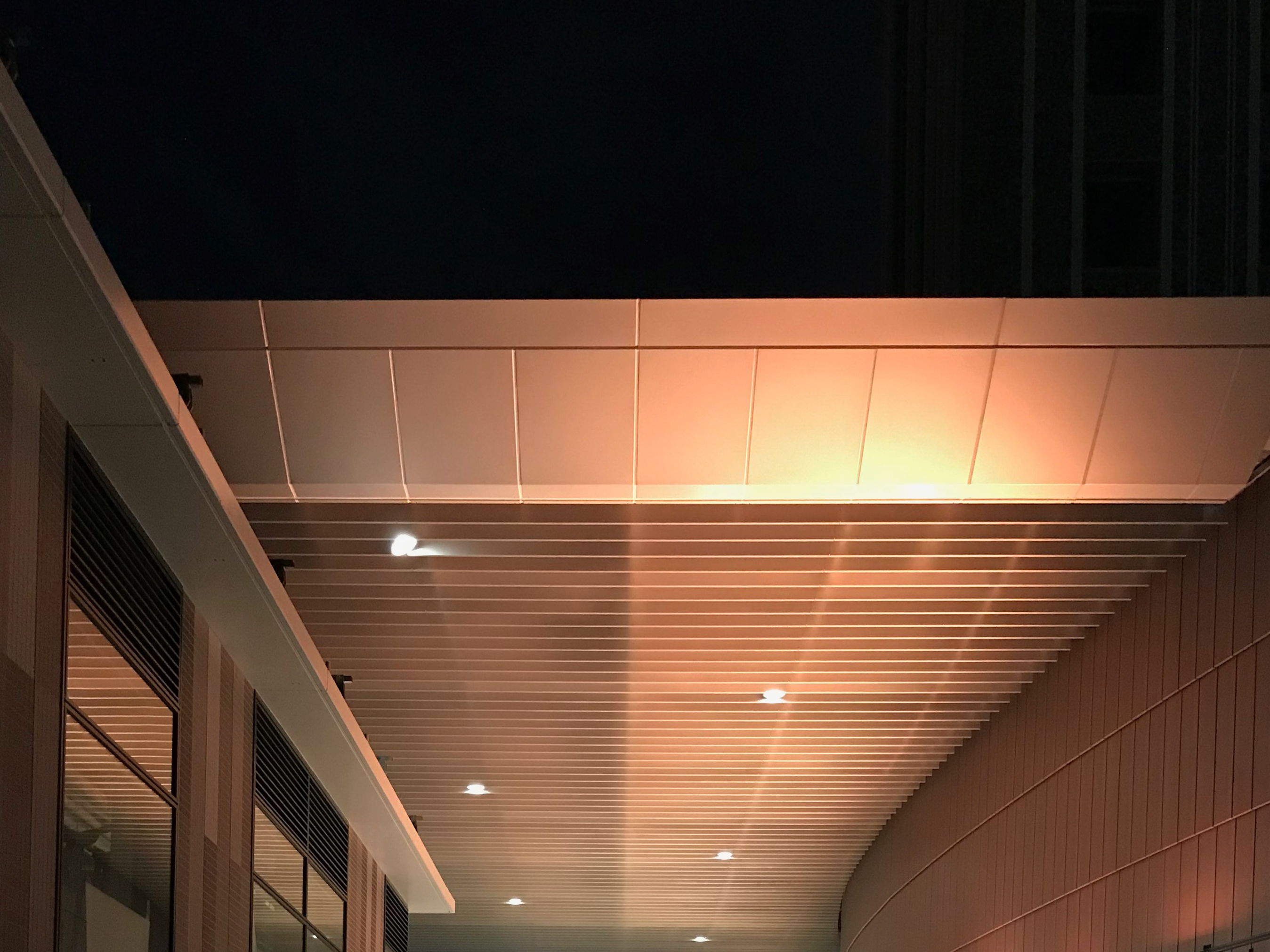
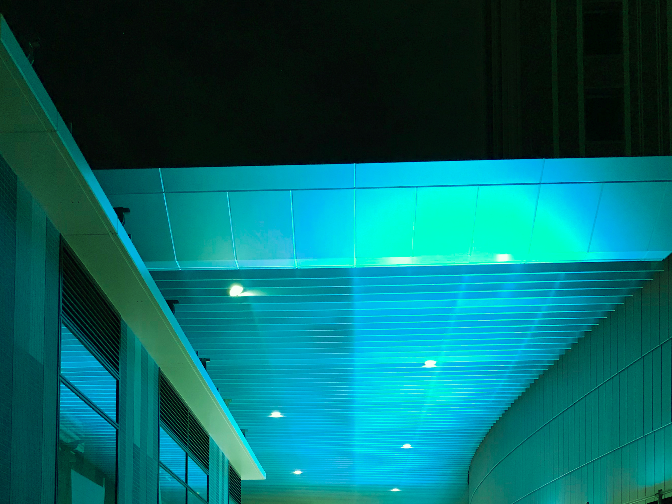
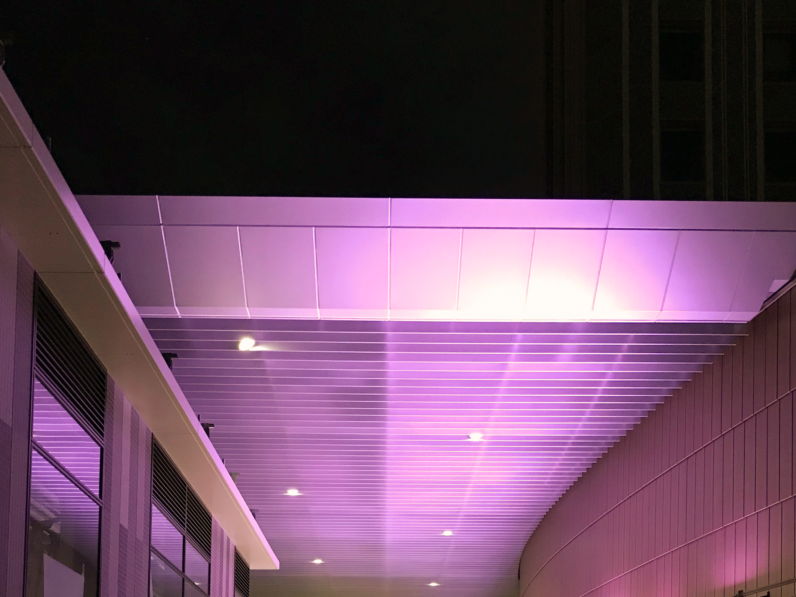
Ce grand hôtel et centre commercial a été construit dans le quartier qui sera au cœur des Jeux Olympiques de Tokyo. Sa mise en lumière extérieure devait donc être significative de son identité nocturne et relier les deux parties de ce complexe. Pour ce lieu stratégique au niveau transports, il fallait également penser un éclairage original de la galerie de passage sous le bâtiment. Enfin, I.C.O.N. a également été chargé du conseil technique auprès de l’architecte pour son éclairage intérieur.
Pour la façade de cette immense tour-hôtel, des spots ont été adaptés pour créer une lumière très blanche, faisant ressortir le carrelage qui la recouvre.
Du côté centre commercial, le grand auvent a également été magnifié en blanc afin d’exprimer la continuité du complexe. De même, l’éclairage paysager et des circulations extérieures renforcent cet effet, tout en exaltant le design des architectes d’Azusa Sekkei.
Par ailleurs, pour la galerie permettant aux usagers de relier les transports, l’idée était de leur donner à sentir les saisons et de s’attacher à la structure du lieu. Ainsi, son éclairage indirect en douze couleurs change suivant le mois de l’année (le rose des fleurs cerisiers en avril, bleu de mer en été, orangé à l’automne…) et présente parfois un léger mouvement.
This hotel and shopping center was built in the district that will be one of the cores of the Tokyo Olympic Games. Its exterior lighting was therefore signify its nocturnal identity and connect the two parts of this complex. For this strategic place in transport, it was also necessary to think of an original lighting of the passage gallery in the middle of the complex. The architect also requested I.C.O.N. to supervise the interior lighting.
For the facade of this high hotel tower, semi-custom-made spots were adapted to create a very white light, bringing out the tiling that covers it.
On the shopping center, the large beam was also magnified in white to express the continuity of the complex. In the same way, landscape lighting and exterior circulation reinforce this effect, while exalting the design of Azusa Sekkei.
In addition, for the gallery which connects 2 stations, the idea was to give a feeling of the seasons change and to focus on the structure of the canopy. Thus, its indirect lighting in twelve colors changes according to the month of the year (cherry blossoms pink in April, ocean blue in July, autumnal orange in October…) and sometimes has light movements.